In Blackburn, there is presently a major gas main renewal scheme taking place at a critical junction on the network.
Instead of relying on the usual abysmal temporary information sign mounted on a 1050 x 750 frame, the traffic section have taken an unusual step and provided a slightly more useful sign that offers an alternative route.
There have been some glitches that take the shine off the overall product, notably the traffic management contractor doing their own thing and ignoring the design sent by the engineer; nothing new there then.
The interesting thing is the attempt to open a debate on the use of height roundels on signs. I will be covering this in much more detail in the future.
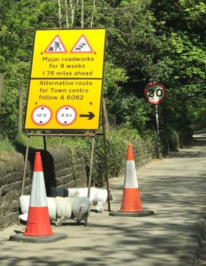
The good: information is visible at a reasonable x-height. The bad: the sign makers using unlawful “1.75 miles” as a legend. The unusual: dual roundels for height limits.

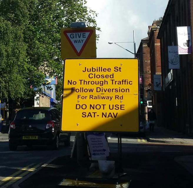
The other sign to direct traffic away from the roadworks. This one lacks the dual roundels, but it will be interesting to see if any feedback as to which is easier to understand follows.
These signs give drivers an opportunity to completely avoid the roadworks, and then they can return to the original route by following existing signs for town centre. It’s a rare example of diversion signs coordinating with permanent signs reducing the amount of clutter and expense on temporary signs that are often kicked over or vandalised.
Now seasoned sign designers will note there are several ways this pushes the limits of what is allowed right up to the envelope. I have to admit I am using my bad eye to gloss over these too myself, but where temporary traffic signs are concerned which is preferable; a wall of text or the use of symbols which may well be understood quicker at a distance even if the context is not quite what is intended by the Regulations?
Not legible at 30 mph until you’re up close, and then you have two seconds to read it. Breaking the rules somewhat becomes a lesser of two evils situation, does it not?
We are exceptionally poor at diversion signing in the UK, and I hope that the new TSRGD does encourage some experiments with providing information in a clearer manner. It should not be beyond the wit of sign designers to help road users out.
The engineer behind these signs got in touch to say the following:
Before I am crucified by the puritans, I will offer these reasons in my defence in abandoning accepted practice:
1) The diversion route has a low railway bridge and it is imperative that we do not encourage over-height vehicles to attempt the alternative route lest we get a bridge strike or just a truck stopped trying to find a way back out;
2) Given the locations of the signs it was also imperative that the information was clear, concise and could be read quickly due to decision points on the choice of route;
3) The use of familiar sign legends and a typical direction sign layout, even though unconventional in this application, allows road users (who aren’t sign design fanatics, they just want clear directions) to easily assimilate the information 4) On the matter of separate imperial and metric roundels – railway bridge strikes are one of the most costly disruptions on the road/rail interface.
Regardless of what the regulations say about them, it is my belief that the information needs to be clear to ALL road users, some of whom will be used to only metric measurements.
To that end, as an engineer, taking due regard for the damage and disruption a bridge strike will cause or an infarction on what the regulations allow, Ill choose the clarity of the two-sign solution every time. I would also wonder exactly what research was done in to the readability of the combined sign, particularly for European drivers or even those drivers with dyslexia etc as to how quick this vital information can be assimilated without question or doubt.
As designers we need to remember that the people we are catering for are NOT engineers, some will be quite distressed by changes in their routine or be unfamiliar with the area and need reassurance they’re going the right way.
The regulations must always be the guiding principle for design, but there are some things the regulations can’t cover adequately; therefore we should take a pragmatic approach and mould their application to suit the situation.
I have always supported less is more when doing roadworks signs, and it seems that at last others agree with me.
Unfortunately that issue of contractors doing their own thing always crops up when you try and take control over what they decide to install off their own backs… compare and contrast:

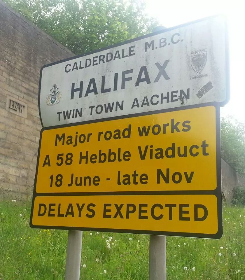


The ones that came out right.
And the horror of horrors. Spelling mistakes, wrong typeface… I was not happy when this appeared and demanded it be rectified ASAP.

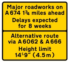
Of the two signs, the second one is, in my opinion, better, although it could be improved.
There’s no real need for “Major roadworks” as the 7001 is present. Similarly “for 8 weeks” is less than helpful without a start or end date.
I’d suggest replacing the two lines of text in the top panel with just dates, i.e. “10 May – 5 July”.
The dual unit roundel is the only one that TSRGD now permits, so that is correct, whereas the two roundels on the top sign are incorrect.
I’m not sure I’d bother with a green route number patch in this case – and the inclusion of a white border is incorrect, although the patch does make the route stand out better than simple black text would.
The stacking order of the ahead and right turn is, strictly speaking, wrong but in this case makes for a more easily understood sign.
Overall, a better sign than the normal worded “War and Peace” length version.
LikeLike
The engineer who wrote to you has done a fine job overall. Had to chuckle at the spacing of ‘A 6062’ in the first one and its absence before the metre symbols, though ☺. Also note that dual height roundels are supposed to be supersized to give users a fighting chance of reading all those superfluous numbers!
I suspect the requirement for a sea of [English] text, especially on temporary signs, is yet another ploy by DFT et al to thwart UK ratification of the Vienna convention. Even if the genesis was manual lettering with tiles, I bet practically nobody uses them any more. So it’s entirely reasonable for the designer to consider the purpose of the sign(s) from first principles, not slavishly follow the [loaded] rules and bypass all that bunfighting. Many more words could be removed from all the examples shown.
LikeLike
Thanks, good post! 😉
LikeLike
The engineer who wrote to you has done a better job than TSM/ you, IMO. They should be given a knighthood for sticking to the spirit of unwordy symbolic signs advocated by Worboys report ¶28. Had to chuckle at the unit spacing of ‘A 6062’ in the first one and its absence before the metre symbols, though ☺. Also note that dual unit signs are (probably) meant to be supersized so that the values are 100 % and 80 % x-height of any enclosing sign!
I suspect the requirement for a sea of [English] text, especially on temporary signs, is yet another ploy by DFT et al to thwart UK ratification of the Vienna convention. Even if the genesis was manual lettering with tiles, I bet practically nobody uses those any more. This further leads to undersized lettering and the same mistake is made on almost all supplementary plates. Many more words could be removed from all the examples shown in this post. Our inability to move towards ISO 8601 dates and times or replace ‘for’ with surrounding ‘↑’ in distances is embarrassing.
LikeLike